MathCS.org - Statistics
3.2 Creating Pie Charts
Pie charts
are a convenient way to visualize data if the categories that divide
the data are not that numerous, like 10 or less. Pie charts apply to categorical
variables (either ordinal or nominal). In most cases pie charts are
not appropriate for numerical variables since there usually would be too
many different numbers for that type of variable.
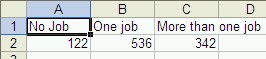
Example: Suppose a survey was done among 1000 adults about their job situations, with the following results:
No Job One Job More than one Job 122 536 342 Use a Pie chart to represent this data.
Instead of using a table - which may or may not look "pretty" - we need to represent the data in a pie chart. We proceed as follows:
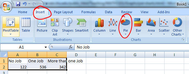
- Start Microsoft Excel
- Enter the above data, using the first three columns and two rows of the spreadsheet. Your spreadsheet should look similar to this:
- Highlight the six cells containing the titles and numbers,click on the "Insert" ribbon and hit the Pie chart wizard:
There are a number of different pie chart types. For now, pick the first type to create a simple 2D pie chart, which will be inseted into your spreadsheet.
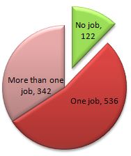
- You now have a variety of Design, Layout, and Format options. Experiment to create a pie chart to your liking. I, for one, like this layout:
Note that Excel has automatically converted the raw data into percentages of the total and rounded it properly. In other words the figure for "one job" was converted to
536 / (122 + 536 + 342) * 100 = 536 / 1000 * 100 = 53.6 %, rounded up to 54%
Practice: If your pie chart does not have a 3D-look, what would you need to do to re-create the chart but this time with a 3D look? Or if you did pick a 3D look originally, now pick a 'flat' design.
Note: If you move your cursor over the various slices of the pie while inside Microsoft Excel, you will see the total number as well as the number in percent corresponding to that slice. In fact, when you double-click on the pie you can choose the "Data Labels" tab from the "Format Data Series" dialog box to include the numbers in a variety of formats in the graph - try it out now.
Exploding your pie chart: You can also explode your pie chart (which sounds a lot more fun than it is). Simply click on one of the pie slices (not any text, though) and drag it outwards a little - your chart will explode! You can either make one slice move out of the pie or all slides. This is useful to highlight one particular slice. In the example I have also colored that slide green to excentuate it even further by right-clicking on it and selecting "Format Data Series".