 MathCS.org - Statistics
3.3 Creating Bar Charts
Bar charts are applicable to categorical variables, just as pie charts, but they can accommodate more categories than pie charts.
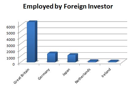
Example: A survey was done to find the number of workers employed by major foreign investors.
Great Britain Germany Japan Netherlands Ireland 6500 1450 1200 200 138
Construct a bar char representing this data.
This time we need to represent the data as a bar chart, with vertical bars, or columns, representing the number of workers employed by major foreign investors (in some unit of measurement):
- Start Microsoft Excel
- Enter the above data, using the first five columns and two rows of the spreadsheet. Do not worry about the fact that you may not be able to see the entire country names in the first row.
- Highlight the ten cells containing the titles and numbers and use the "Insert" ribbon to insert a bar chart. As with the pie chart, there are many different styles you could pick. I went with "Clustered Horizontal Cylinder", which gave me:
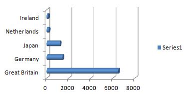
Nice, but not great (I don't like that the bars go horizontally, it would be nicer if they went vertically instead), so we will want improve on this a little:
- double-click on the existing chart to bring up its Design ribbon
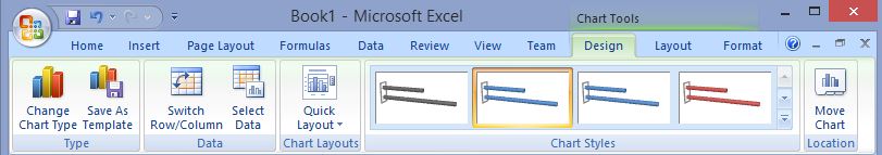
- Click on the Change Chart Type and select the Column template and pick 3D Clustered Column
- Select the 'Series 1' label on the chart and remove it by hitting Delete
- Switch to the Layout ribbon and add a Chart Title
- Right-click on the y-axis, pick Format Axis and make sure that the range on the y-axis goes from 0 to 6800
This should be the result of our reformatting effort so far:
Try this: To excentuate Germany, say, change the color of Germany's vertial bar to, say, green (right click on the bar, etc.). Changing colors is but one trick to draw attention to one particular feature of your chart. In fact, you can use such techniques to highlight some data and downplay others without actually changing the data. We will explore this further in a homework assignment.